Campus Vision
While a campus plan must be many things - functional, cost-efficient, and technically sound - it must never lose sight of the fact that its objective is to provide a setting that both symbolizes and inspires human excellence. The quality of the University environment is indicative of the values and aspirations of the community.
Page 7 - CCEP, 2001

With its foundations firmly established in Arthur Erickson’s1969 plan, the University of Lethbridge has developed one of the most striking and recognized university campuses in Canada. Erickson’s inspired vision has served the University well – the powerful image of University Hall has become a central symbol of the institution and 30 years later the building remains inseparable from a definition of the University. In the Maclean’s 2001 Guide to Canadian Universities and Colleges, an evaluation of the University begins with a reference to its setting:
Renowned architect Arthur Erickson designed the University of Lethbridge’s central building, University Hall, anchoring the campus within the folds of the scenic Oldman River Valley in southern Alberta. It seems an appropriately cozy niche for a university with a keen sense of its place in the world.
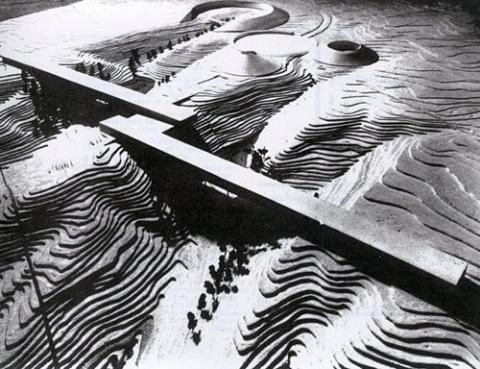
The strong elemental form of Arthur Erickson’s University Hall, which spans the undulating coulee valley, echoes the form of Lethbridge’s famous Trestle Bridge. Erickson’s original master plan from 1969 recommended further expansion of the campus with similar bridge-like forms further to the south (Figure 3.1). These large spanning structures were linked to the upper plateau where a number of conical shaped buildings would be placed.
Erickson’s vision for the campus was a poetic response to the magnificent landscape of southern Alberta. An
extract from the 1969 plan reads:
Reduced to elementals – the sky as space, the earth as form, every aspect of these becomes poignantly clear. The pattern of clouds, of plowed fields or river coulees, each vividly conveys a meaning. Colour is the sky under storm, wheat stubble in the snow, a newly turned earth. Each set of colours unveils meaning. Thus, to maintain harmony with the land, one must submit to its rules. One must use space generously or not at all. Buildings must grow out of the ground, clustered with other buildings or trees, but never sit blatantly on top of the ground. Forms must be simple and geometrically concise, as elaborate forms and fussy detail show as weakness. As the geometry of the section measures out the landscape, one must work with an equally clear geometry or appear indecisive. Just as the prairie landscape has been reduced to essentials, so must its buildings be elemental.
(Erickson/Massey - Development Plan, University of Lethbridge - March 7, 1969)
Operating in a competitive environment, university’s are increasingly recognizing the importance of the quality of their campus setting in attracting students, faculty and funding. The significance of the campus also extends well beyond its borders. The University of Lethbridge is central to the identity of the City of Lethbridge and its evolution.
The Core Campus Expansion Plan establishes a design vision for the expansion areas of the campus that reflects the high standards of quality evident in University Hall, the Centre for the Arts, and the recently constructed LINC building. Yet the vision for the campus also addresses recognized shortcomings of the existing campus and in particular, places new emphasis on the quality and scale of the outdoor spaces on campus with the intent of creating safe and comfortable courtyards, pedestrian pathways and recreation areas. Key principles of the plan include:
- The creation of appropriate human-scaled building form and massing which supports favourable micro-climates that encourage greater use of outdoor areas and pedestrian systems.
- A network of human-scaled courtyards.
- A flexible building framework that can easily be adapted to a variety of uses as evolving demands dictate.
- An architectural treatment that allows for incremental expansion yet results in a cohesive and attractive design that complements the high quality setting of the campus.
- An appropriate gateway design treatment for the plateau area of the campus that recognizes its role in establishing a “first impression” of the University.
- Relocation and provision of additional parking areas.
- The design of parking lots as both safe and attractive areas at the campus “front door”.
- Celebration of the natural environment of the campus through the preservation and reinforcement of natural areas.
- Creation of a pattern of circulation that emphasizes views to the Oldman River and draws people to the promontory lookout areas referred to as “sacred sites”. These sites should be considered as locations for art installations, earth-works and other public amenities.
